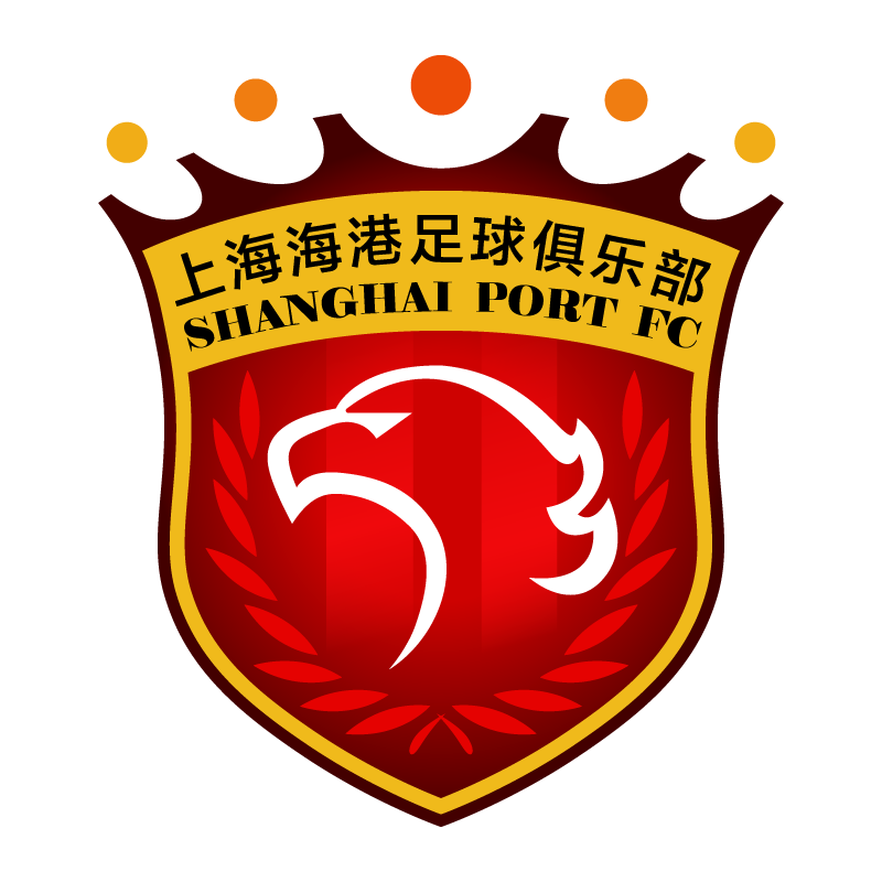
The Shanghai Port logo is red, black, and gold, with a shield-shaped design with an eagle in the middle. The words "Shanghai Port FC" appear on top of the logo. The eagle represents strength, power, and freedom, and reflects the team's identity and principles. The color red symbolizes passion and energy, whereas black indicates elegance and authority. Gold is frequently linked with accomplishment and achievement, lending grandeur to the Shanghai Port FC logo.
Shanghai Port FC, previously known as Shanghai SIPG FC, is a professional football club headquartered in Shanghai, China. The team was formed in 2005 as Shanghai Dongya FC and went through multiple name changes until becoming Shanghai SIPG FC in 2015. The club changed its name to Shanghai Port FC in 2021.
The Shanghai Port Logo serves as the visual backbone of the brand’s identity, reflecting the brand’s core values, mission, and ambition in a single, bold symbol. The design components, such as lines and composition, convey trust, dependability, and progressive qualities, and the color palette represents key brand attributes such as sustainability, growth, and authenticity.