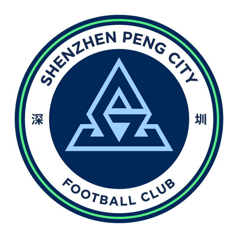
The Shenzhen Peng City logo features a circular design with the club name in the border. The club's symbol is placed in the center of the design in blue color. The circular design of the logo aligns with the style adopted by other teams owned by the City Football Group, emphasizing a sense of unity and consistency within the group.
Shenzhen Peng City FC, originally known as Sichuan Jiuniu before migrating to Shenzhen, is a football club with a long history and several name changes. The club was created on January 26, 1994, and has had several name changes to reflect new ownership and sponsorships.
The Shenzhen Peng City Logo serves as the visual backbone of the brand’s identity, reflecting the brand’s core values, mission, and ambition in a single, bold symbol. The design components, such as lines and composition, convey trust, dependability, and progressive qualities, and the color palette represents key brand attributes such as sustainability, growth, and authenticity.